

MAG7 Models: Positioning and Macro Views
Risk Premias, Volatility Regimes, and Dispersion

New MAG7 Models Released:
Understanding how risk premia, volatility regimes, and cross-sectional dispersion evolve is critical for navigating today's increasingly macro-driven markets. The new models below provide a real-time lens into how risk is being priced across major market leaders, capturing the early signals before they show up in price action. I will be publishing these updated models daily as part of the Macro Regime Tracker, offering a continuous, actionable view into the shifting risk environment and relative value landscape.
The structure of index returns has fundamentally changed. Passive flows and the concentration of capital into a handful of mega-cap names have made the indices more fragile and less representative of the broader market. Year-to-date, tech and the MAG7 have accounted for nearly all major index moves, masking underlying weakness and setting the stage for higher sensitivity to even small shifts in volatility and dispersion.
Tracking these dynamics daily is necessary for anyone serious about risk management and forward positioning. By monitoring concentration, dispersion, and volatility premiums in real time, the Macro Regime Tracker helps anticipate regime shifts, manage exposure, and stay ahead in a market that is narrow, reflexive, and increasingly unstable.
Breakdown:
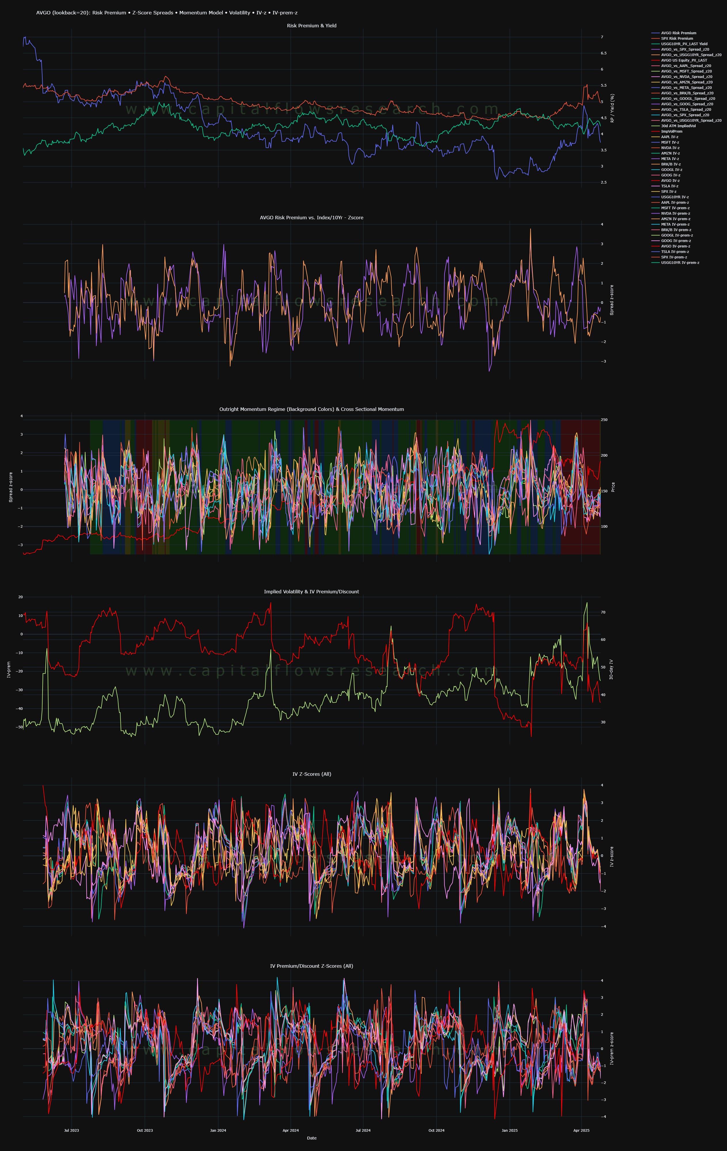
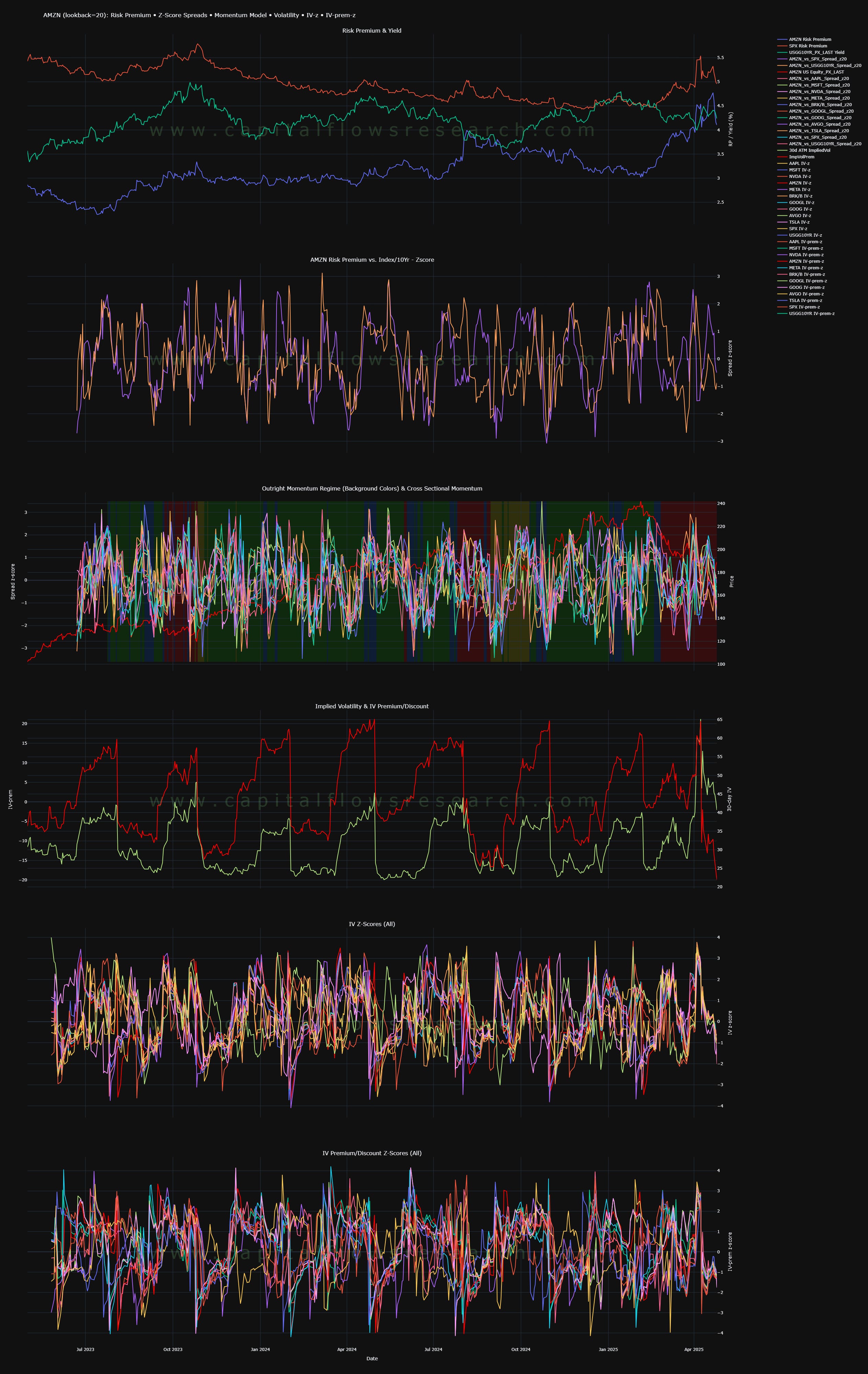
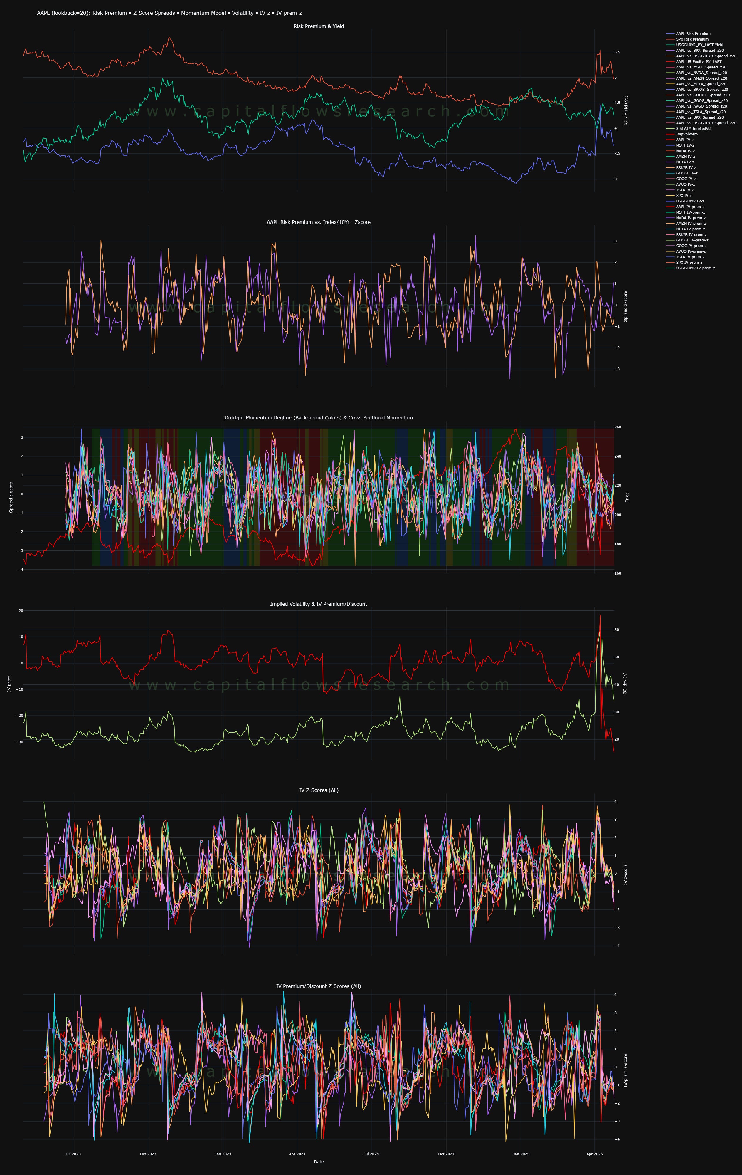
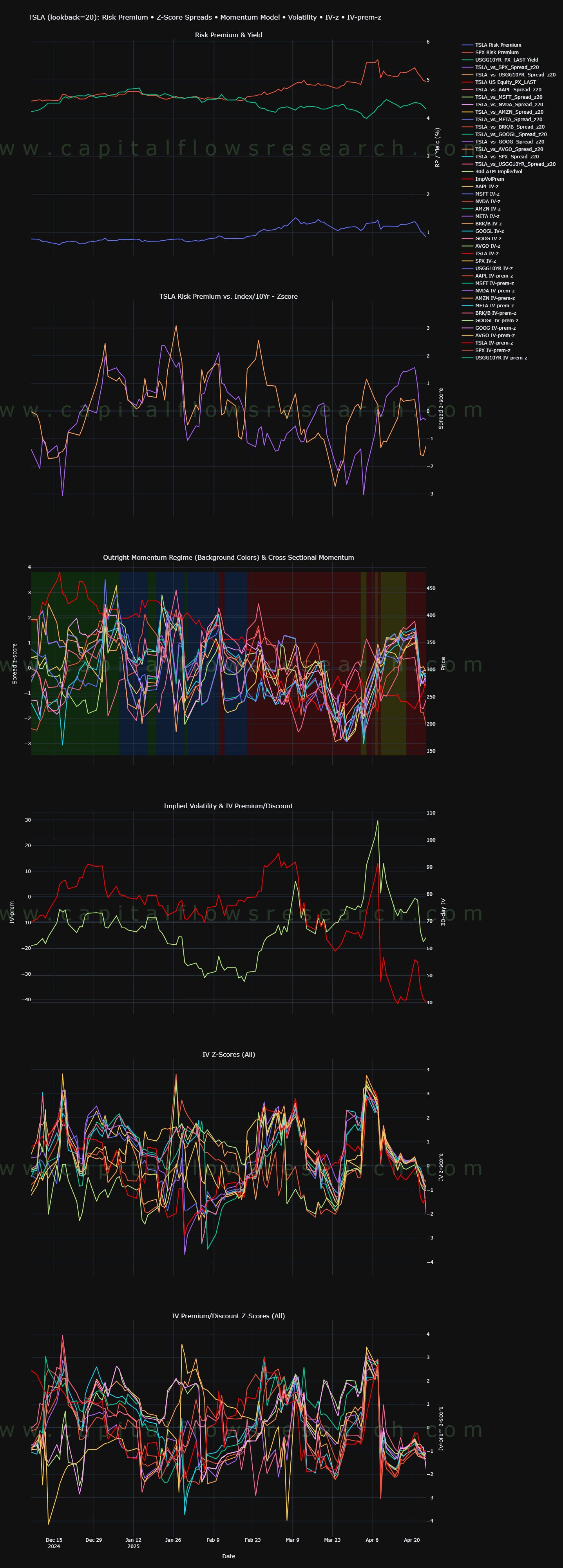
This chart displays the evolution of AAPL's risk premium and yield dynamics over time, using a 20-period lookback window.
The risk premium represents the excess return investors demand to hold AAPL over a risk-free benchmark, reflecting both perceived risk and the compensation required for that risk.
Movements in these lines illustrate changing investor sentiment, volatility expectations, and macro or stock-specific risk pricing.
Expansions in the spread between the premium and baseline yield often signal periods of elevated uncertainty or dislocation, while contractions suggest normalization or compression of perceived risk.

This chart presents the z-score spread between AAPL's risk premium and the blended benchmark of the broader index and the 10-year Treasury yield.
The z-score normalization allows the relative premium to be measured on a comparable, standardized basis, highlighting deviations from historical norms rather than absolute levels.
Positive spreads indicate periods where AAPL's risk premium is materially elevated relative to macro and market benchmarks, signaling either idiosyncratic company risk or opportunity based on dislocation.
Negative spreads show AAPL trading with a tighter premium than broader market risk factors, typically reflecting periods of relative outperformance, lower volatility premiums, or compressions in perceived risk.

This chart overlays two dimensions of momentum analysis:
The background colors represent outright time-series momentum regimes, based on the methodology from Campbell Harvey’s Momentum Turning Points paper. These regimes identify trend direction and inflection points using changes in absolute return momentum.
Green indicates positive momentum.
Red signals negative momentum.
Blue and yellow shades highlight transitional or uncertain phases.
The colored lines track the cross-sectional momentum of AAPL against the other MAG7 stocks, expressed in spread z-scores.
Cross-sectional momentum captures relative strength or weakness between AAPL and its peers, providing a real-time read on whether AAPL is outperforming or underperforming the group during different time-series momentum regimes.

This chart tracks two key dimensions of AAPL’s options market dynamics:
The green line represents the 30-day implied volatility (IV), which reflects the market’s pricing of future expected movement over the next month.
The red line shows the IV premium/discount, calculated as the spread between implied volatility and realized (historical) volatility.

This chart tracks the z-scored implied volatilities (IV) of AAPL and its peer MAG7 names over time.
Each colored line represents the standardized movement of 30-day implied volatility for an individual stock, allowing a clean comparison of relative volatility shifts.
Dispersion (widening of the spread between IV z-scores) signals increasing differentiation in risk pricing among the top index constituents. High dispersion typically leads to greater idiosyncratic returns and a breakdown in index-level correlation.
Concentration (tight clustering of IV z-scores) indicates that market participants are treating the major stocks more uniformly, often reflecting index-driven flows, passive fund buying, or broad macro risk-on/risk-off behavior.
Because the MAG7 heavily dominate index weightings (especially in cap-weighted indices like the S&P 500 and Nasdaq 100), changes in IV dispersion and concentration have direct consequences for index volatility, breadth, and realized returns.
A transition from high concentration to high dispersion often marks regime shifts — moving from a "market beta" environment to a "stock picker’s" environment.

This chart builds on the earlier volatility dispersion analysis by tracking the z-scored IV premium/discount across AAPL and its MAG7 peers, highlighting where the market is overpricing or underpricing future risk relative to realized volatility.
Rising dispersion in IV premia signals a breakdown in uniform risk pricing and growing stock-specific misalignments, while tight clustering reflects systemic flows dominating risk perception — both of which directly influence index volatility structure, breadth, and forward return stability.

Long Term View: (Short term view below)
AVGO:
AMZN
MSFT:

GOOGL:

META:

NVDA:

BRK.B:

AAPL:
TSLA:

ZOOMED IN VIEW: YTD
AVGO

AMZN

MSFT:

GOOGL:

META:

NVDA:

BRK.B

AAPL:

TSLA:
Final Note:
I wanted to release these models BEFORE this week because we have multiple MAG7 earnings that will take place in the context of the tensions that these models depict.
As always, a Pepe for the culture:

The information on this website/Substack is for information purposes only. It is believed to be reliable, but Capital Flows does not warrant its completeness or accuracy. The information on the website/Substack is not intended as an offer or solicitation for the purchase of stock or any financial instrument. The information and materials contained in these pages and the terms, conditions and descriptions that appear, are subject to change without notice. Unauthorized use of Capital Flows websites and systems including but not limited to data scraping, unauthorized entry into Capital Flows systems, misuse of passwords, or misuse of any information posted on a site is strictly prohibited. Your eligibility for particular services is subject to final determination by Capital Flows and/or its affiliates. Investment services are not bank deposits or insured by the FDIC or other entity and are subject to investment risks, including possible loss of principal amount invested. Your use of any information which is proprietary to Capital Flows or a third-party information provider shall only be used on individual devices without any right to redistribute, upload, export, copy, or otherwise transfer the information to any centralized interdepartmental or shared device, directory, database or other repository nor to otherwise make it available to any other entity/person/third party, without the prior written consent of Capital Flows.
Sorry if this is a basic question. But for the IV discount/premium in relation to historical RV
Which side of IV is it taking (i.e Call or Put IV)? Or is it skew dependent, i.e if Call Skew, selecting the highest IV Call? Or is IV just aggregated across all options regardless Call/Put?
Thank you. How would you interpret this data and implement it into decision making?