

Terminal Rate: Reading the Endgame in STIR Curves
How the forward curve in the US, Eurozone, and UK are unfolding

Big Picture:
When we approach interest rates, understanding HOW to analyze the market’s expectations is critical because it frames points in time like the Jackson Hole meeting I explained here:

What I want to do in this report is explain HOW to think about the terminal rate and WHY it matters for the Fed, ECB, and BoE when analyzing the respective forward curves.
Terminal Rate: Reading the Endgame in STIR Curves
When we talk about the “terminal rate” in short-term interest rate markets, what we’re really looking for is the end of the road, the point where policy is expected to settle once the current cycle of cuts or hikes has run its course. It’s visible in the strips: SOFR in the US, Euribor in the Euro area, and SONIA in the UK.
This matters because the terminal anchors the curve. It tells us not just where policy sits today, but how the market imagines the journey will end. If the path runs deep into easing, the trough will be visible in the back end. If more hikes are on the table, the peak is clear. In either case, the terminal becomes the pivot point around which expectations, positioning, and pricing revolve.
It’s worth being precise here. Economists sometimes use “terminal” to mean the long-run neutral rate “r*” (R star), the steady-state level where policy is neither restrictive nor stimulative. That’s not what I’m watching. For me, the terminal is cycle-specific: the implied peak or trough in this policy run. It’s the market’s best guess of where the central bank will stop cutting, or stop hiking, before reversing course.
Location: Time and Distance
Once you frame it this way, the idea of “location” becomes critical. And location is always two-dimensional.
Time: How far out on the calendar does the curve place the low (or the high)? Are we talking months or years?
Distance: How far is that point from where policy stands today? Is the cut shallow and close, or deep and distant?
Together, time and distance give us a map of both the velocity and severity of the expected cycle.
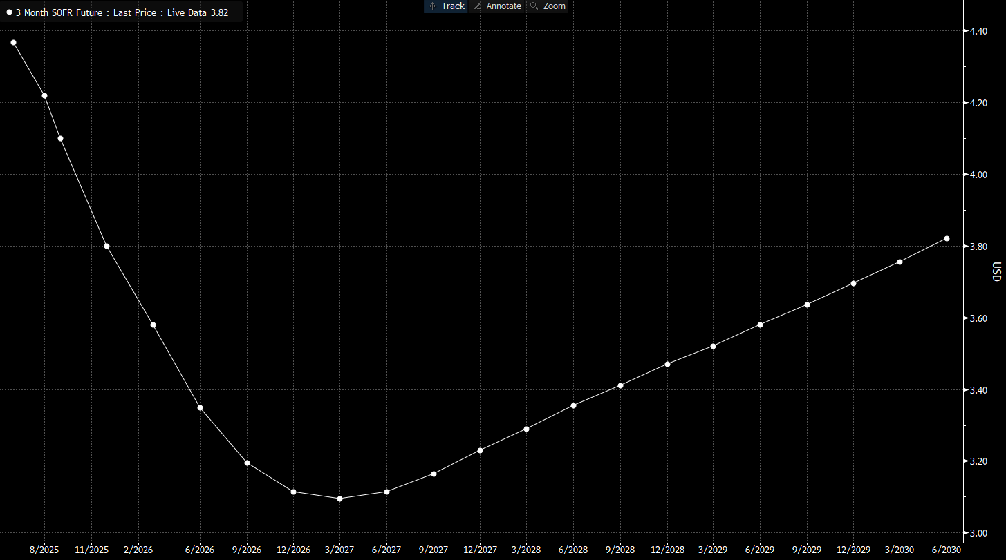
The SOFR Curve: A US Case Study
Take SOFR today. The effective rate sits at 4.33%. From there, the curve bends steadily lower, reaching its trough in March 2027 at 3.095%. That’s roughly 125 bp of cuts priced over the next year and a half.
Seen through the time/distance lens: the “when” is 19 months forward, and the “how far” is ~125 bp lower than today. The market’s balance is visible in the shape, easing is coming, but the scale is modest, and the trough is short-lived. Almost immediately, the curve begins to reprice higher, pointing to rates drifting back toward the high-3s by the late 2020s.
It’s the classic push and pull: a market confident that cuts are coming, but unwilling to believe rates will stay pinned at the floor for long.
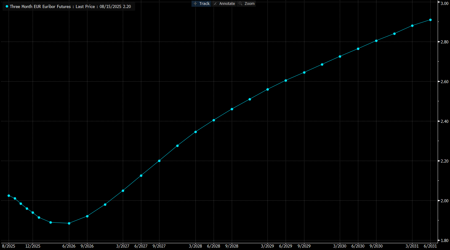
The Euribor Curve: A Shallow Path
In Europe, the story is softer as they are near the end of the cycle. Euribor sits at 2.026% today, with the trough coming as soon as June 2026 at 1.885%. That’s just 14 bp of easing barely perceptible compared to the US. Both dimensions are compressed: the time is less than a year away, and the distance is shallow. The message is clear: the ECB has little room to move, and the market isn’t betting on a deep or prolonged ending of the easing cycle.
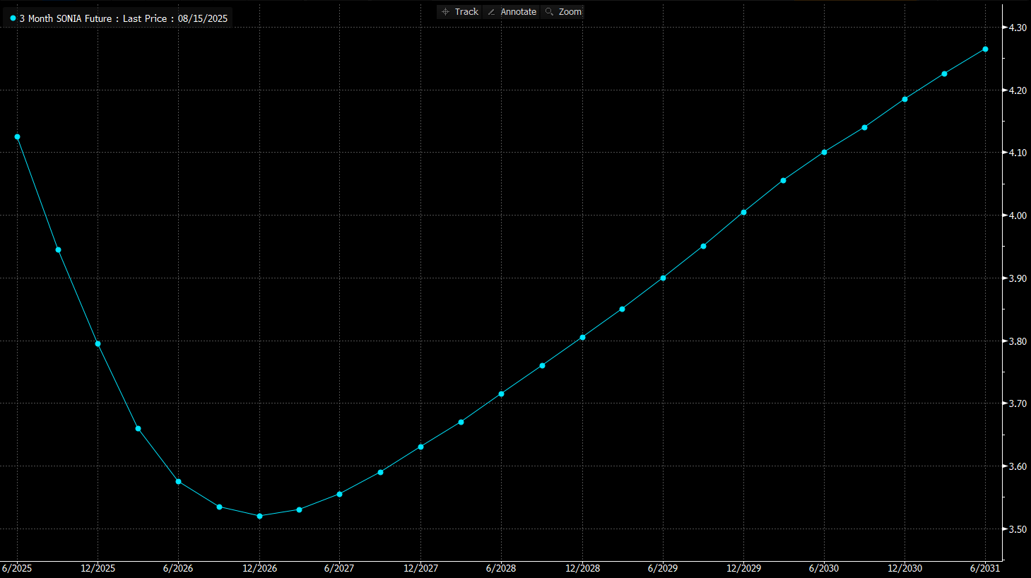
The SONIA Curve: A Modest UK Easing
The UK sits somewhere in between. SONIA is at 3.96% today, falling to a trough of 3.52% in December 2026. That’s about 40 bp of easing, with the low point ~16 months away. Once again, the curve refuses to leave policy at the bottom for long. Beyond 2026, rates rise steadily, back above 4.20% by decade’s end.
Central Bank Meetings as a Clock
Another way to think about “time” is in terms of policy meetings. Between now and the March 2027 SOFR trough, the Fed has 13 meetings/opportunities to reframe the path. The ECB, by contrast, has only 7 meetings before its Euribor low in June 2026. The Bank of England sits in the middle, with 11.
This matters because the curve is not just about months on a calendar, it’s about how many decision points stand between here and the implied end. Fewer meetings mean fewer chances for repricing, which helps explain why the Euribor trough is both shallower and sooner.
Time & Distance: Velocity and Severity
Finally, think about how the terminal moves along those two axes.
If the trough comes closer in time but doesn’t shift in level, the implied cycle is faster: more moves compressed into fewer meetings.
If the trough deepens without moving forward, the implied cycle is more severe: larger cuts spread over the same horizon.
If both shift closer and deeper you’re looking at a fast, forceful policy response. If both drift further out and shallower, it signals caution and delay.
That’s why tracking the migration of the terminal across these two dimensions is so valuable. It tells us not only where policy is expected to land, but how aggressively the market thinks central banks will get there.
Past & Present Terminal Levels
Keep reading with a 7-day free trial
Subscribe to Capital Flows to keep reading this post and get 7 days of free access to the full post archives.