There is NO Debt Problem
Perma bears always lose
Any asset will have a higher degree of risk when you add leverage. One of the main factors I trade through the economic cycle is the quality vs junk factor. While we won’t go into the intricacies of it (trust me there is a lot here), the main idea is that a company’s equity will be dramatically influenced depending on how much debt they take on.
If a fast-growing company takes on more debt, they are likely to increase their investment and future earnings. Inversely, if their sector of the economy begins to decelerate, they are the first to be at risk due to the obligations they have taken out. This directly impacts their stock price.
Part of generating alpha is connecting the beta of various stocks to their fundamental factors and then connecting those with the macro regime. Let me just say this now, if someone finds an edge in extracting returns from a specific factor, they aren’t telling anyone!
Everyone likes to pretend that all of us are in it together but once you move to a higher level, you are at war with other hedge funds. This goes on behind closed doors while everyone does this on social media and in public interviews:
A helpful intro to these ideas is the allocator’s edge: https://www.amazon.com/Allocators-Edge-alternative-investments-diversification/dp/0857197932
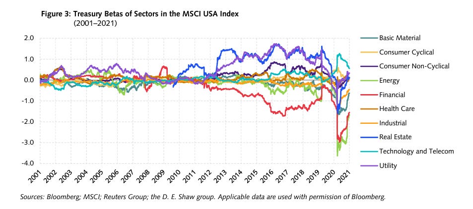
DE Shaw has some helpful articles on this as well: https://www.deshaw.com/assets/articles/DESCO_Market_Insights_Dispersion_in_Stock_Bond_Sensitivities_20220622.pdf
Again, DE Shaw is putting out these articles because everyone knows this stuff. This is the baseline for trading equity sectors and factors.
There are some helpful charts from the article though:
So you might be wondering, ok how does this whole debt situation impact the world’s most important equity index? This is where all the perma bears absolutely lose it.
Net debt / EBITDA for the S&P500 is at one of the lowest points it’s ever been:
Same for total debt to EV on the S&P500:
Total debt to equity tells the same story:
And total debt to total assets:
Other equity indices such as the Russell 2000 don’t have the same quality but this is obvious in the Russell’s relative performance to the S&P500. For all of the bearish views on the S&P500, no one has taken the time to share charts about how strong the balance sheets of these companies are.
Another thing you should do is go into the Flow of Funds data from the Fed and look at the distribution of debt in the consumer sector for the past 40 years. You will see a very similar trend to these charts where levels were higher going into 2008 but then dramatically decreased.
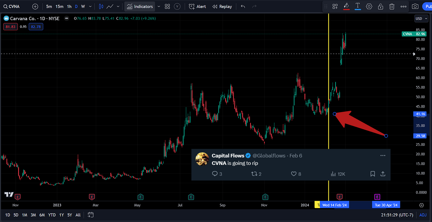
As we move into 2024, I will be running more specific trades that are aligned with these factors (full breakdowns/trade ideas will be for paid Subscribers). I already shared the CVNA trade with Twitter followers. This was one of many trades I was running:
The main thing you need to do is quantify HOW growth, inflation, and liquidity are dynamically changing. You then connect these with factor flows and monitor HOW capital is moving across the risk curve. All of these flows are mechanical.
If you are new, check out the synthesis of educational articles I have written here. I spent time explaining how each part of the macro process works and providing hundreds of SSRN papers and book recommendations. READ THESE!
And if you are wondering, no, normal people don’t spend their Friday nights digging into the intricacies of the S&P500’s balance sheet :)


