


Equity Drivers:
Understanding equities comes down to 3 things:
A view of earnings
A view of valuations
A view of positioning
If you understand each of these variables AND connect them properly, you can properly manage equity exposure. I will emphasize this over and over, we can never know the future but we can properly interpret the present. Manage risk and the returns will come!
The educational primer on the S&P500 can be found here. I would strongly encourage you to review it because we are entering a period where understanding HOW to differentiate between the drivers will be critical.
Research HUB: Infinite Complexity, Chaos and the S&P500

The way in which you contextualize your actions dramatically changes your ability to have foresight.
Microstructure and Structural Positioning:
Before we get into the drivers noted above, we need to touch on one of the biggest risks in the equity market today, passive flows. I did a spaces with Michael W. Green that touched on this and the recording can be found here: https://x.com/Globalflows/status/1864026753594700038
Why do passive flows matter? The ownership of passive continues to increase exponentially. This matters because passive vehicles buy indiscriminately which means they just buy whatever is in their charter without regard to fundamentals.
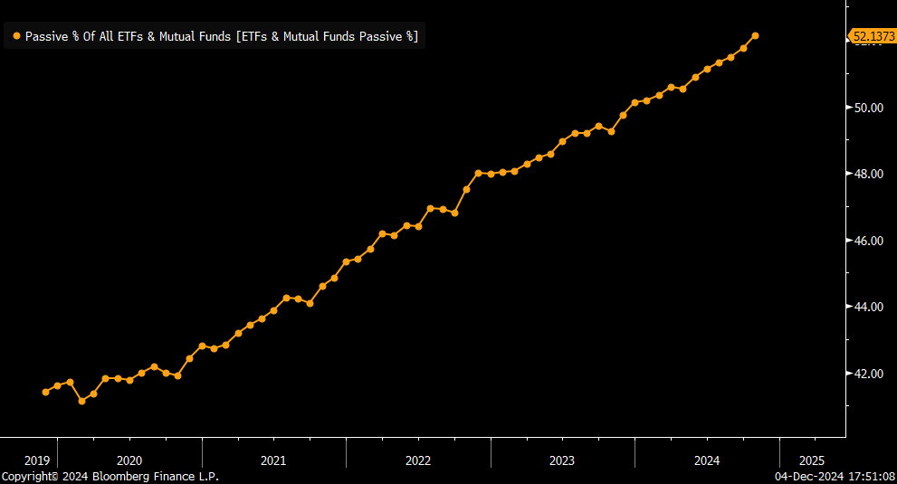
This matters because passive creates a greater inelasticity in the tradeable float of stocks. A tangible example of this dynamic is how execution liquidity works on an intraday time horizon. This is a visual from the Intraday Trading Primer that was written (can be found here: Link). As a player executes, they move the price until they get their fill. After they get their fill, the market readjusts from the temporal imbalance. This dynamic takes place ALL DAY LONG across all tradable products.

Now imagine this intraday dynamic but on a multi-year timeframe. This was the chart Mike shared visualizing this risk:

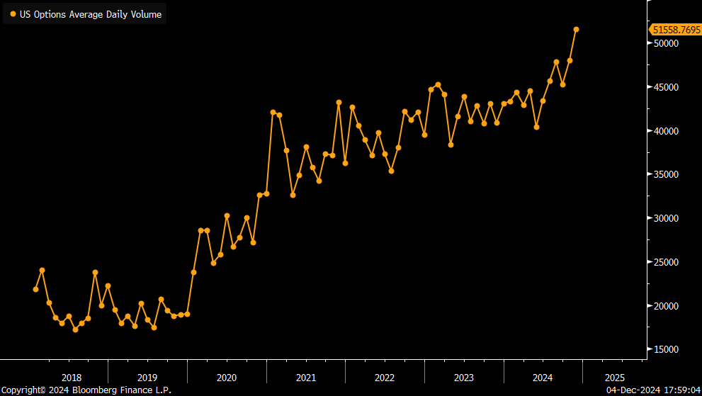
On top of this passive flow dynamic, we are having option volume hit all-time highs. This matters because we continue to see a concentration of leverage in the options market cause the SPEED at which the market moves to increase which can result in fatter tails. In other words, it’s way easier for super-crazy stuff to happen.
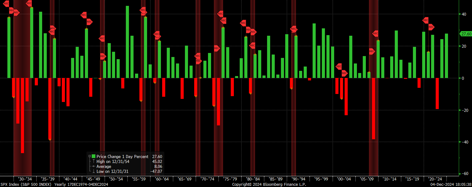
One of the main implications of this is that the next real recession the US has could be one of the worst in financial history. Just remember, not even 2020 closed the year with negative returns for the S&P500. The chart below shows the yearly returns of the S&P500 with recession shaded in red. The main takeaway from this chart is it takes A LOT to have negative returns for the S&P500 on a yearly basis. However, when you have the end of a roaring 20s type period where structural and market risks overlap, you can have multiple years of negative returns (see the great depression on very left hand side of the chart):
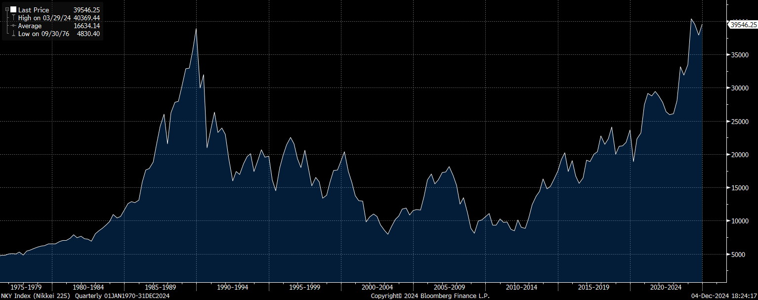
It’s important to remember that during melt ups AND melt downs, the returns are extreme in BOTH directions. The Nikkei had a 90%+ yearly return before it went off a cliff in the 70s.
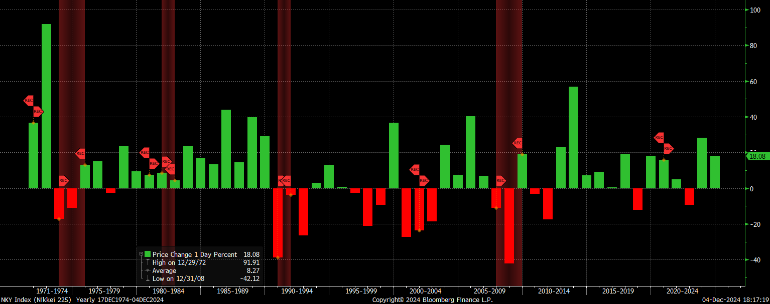
Lost decades are a real thing: Nikkei chart
Now to be clear, the implication behind these points isn’t that the only safe place is cash and that the world is about to end. NOT AT ALL! The takeaway is YOU NEED A PLAN. Being aware of risks and redundancy planning is the only way to MANAGE these risks. As I laid out in the very first article on this substack: Preparation before prediction.
How To Think About Markets, Trading, and Wealth Management

This is the first publication so I am going to lay out a number of ideas in order to frame the research, thoughts, and trade ideas I am going to write.
How Do We Prepare?
We started this article by saying that everything comes down to understanding 3 things in equities:
A view of earnings
A view of valuations
A view of positioning
This is true for ALL time horizons. We simply need to quantify our view on a yearly, quarterly, monthly, and weekly basis. After we quantify our view of these dynamics across ALL these timeframes, we can think clearly about the actions we take.
“Clear thinker” is a better compliment than smart
-Naval
The rest of this report will focus on mapping these variables across ALL these time horizons.
Keep reading with a 7-day free trial
Subscribe to Capital Flows to keep reading this post and get 7 days of free access to the full post archives.