Macro Report/Insights: Charts Edition
Chart Deck and FOMC Thoughts
Hey everyone,
Today, I am going to share a number of charts and provide some short concise thoughts on them. Several of the charts will be key for FOMC tomorrow! Let’s get into it!
Macro Growth Charts:
Economic growth in the US has surprised to the upside over the past 4 months:
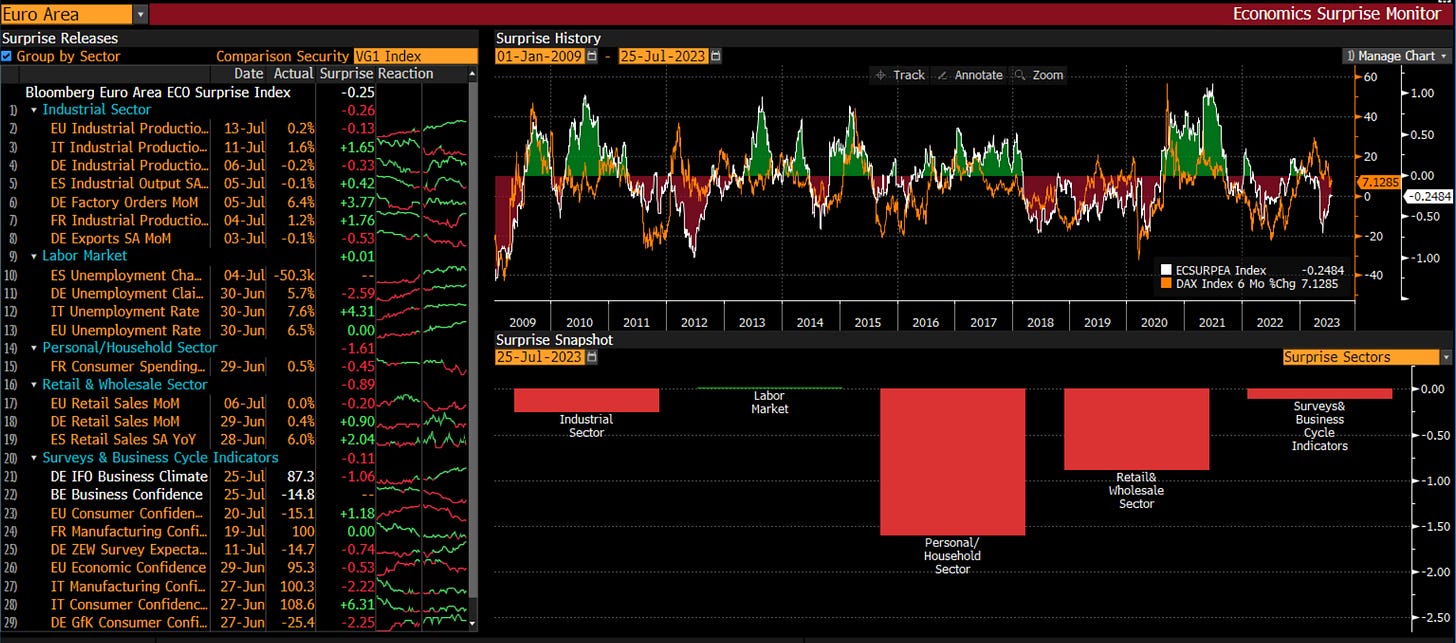
This is not the case in the Eurozone though:
The strength in growth and inflation we have seen in the UK has enabled the BoE to tighten considerably thereby causing the Pound to rally against the Dollar and Euro.
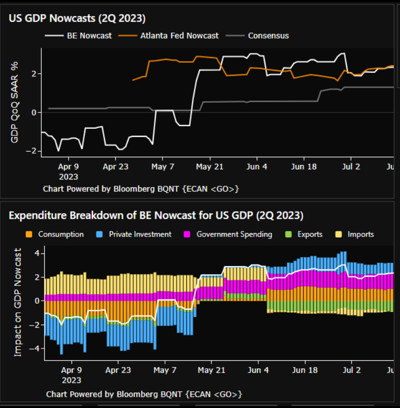
US nowcasts remain in positive territory:
Macro Inflation Charts:
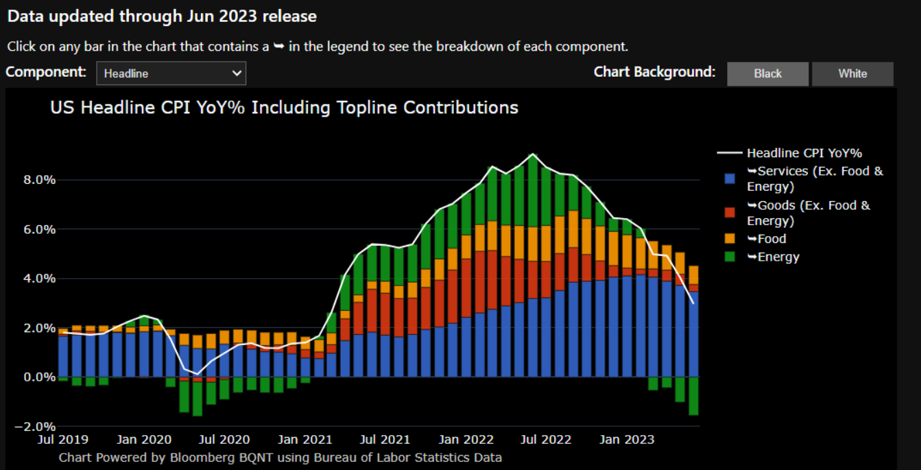
Both core and headline inflation have decelerated from their highs. The question is about the speed of a potential deceleration moving forward.
I touched on the tension we are seeing between growth and inflation data as it connects with forward expectations here:
The primary focus for the market and FED remains services inflation. However, watch the correlation between oil and bonds here. If CL continues to push up, we could begin to see some pass-through to headline CPI:
Big picture though, the energy component continues to pull down CPI:
Inflation swaps continue to price 2.5% and then readjust:
Wages continue to be a key input for the services portion of inflation:
Macro Fixed Income Charts:
FED actions over the past month have pushed real rates on the short end well above 10-year and 30-year real rates:
This has caused the yield curve to flatten. The spot yield curve is well below the forward curves:
However, we have yet to see inflation swaps make a pronounced move down and the forward curve price a more realistic path for FED funds. Here are inflation swaps on multiple durations (represented by the USSWIT) and both headline and core CPI:
See the primer I wrote on the bond market here:
Macro FX Charts:
FX continues to move with duration positioning. Watch implied vol in connection with the EURUSD and bond correlation:
FX vol has increased marginally from its low:
However, cross-currency basis swaps remain elevated:
S&P500 and Equities:
Valuations are a bit extended for SPX:
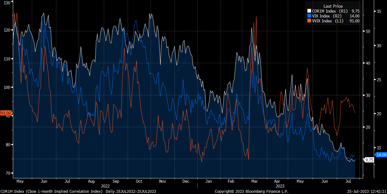
The VIX and implied correlation remain incredibly low:
However, we are seeing the typical hedging pressure moving into FOMC. Watch for monetization of hedges as expectations are realized tomorrow: (chart from T1Alpha)
Here is the article on how to build an S&P500 model:
Crypto Charts:
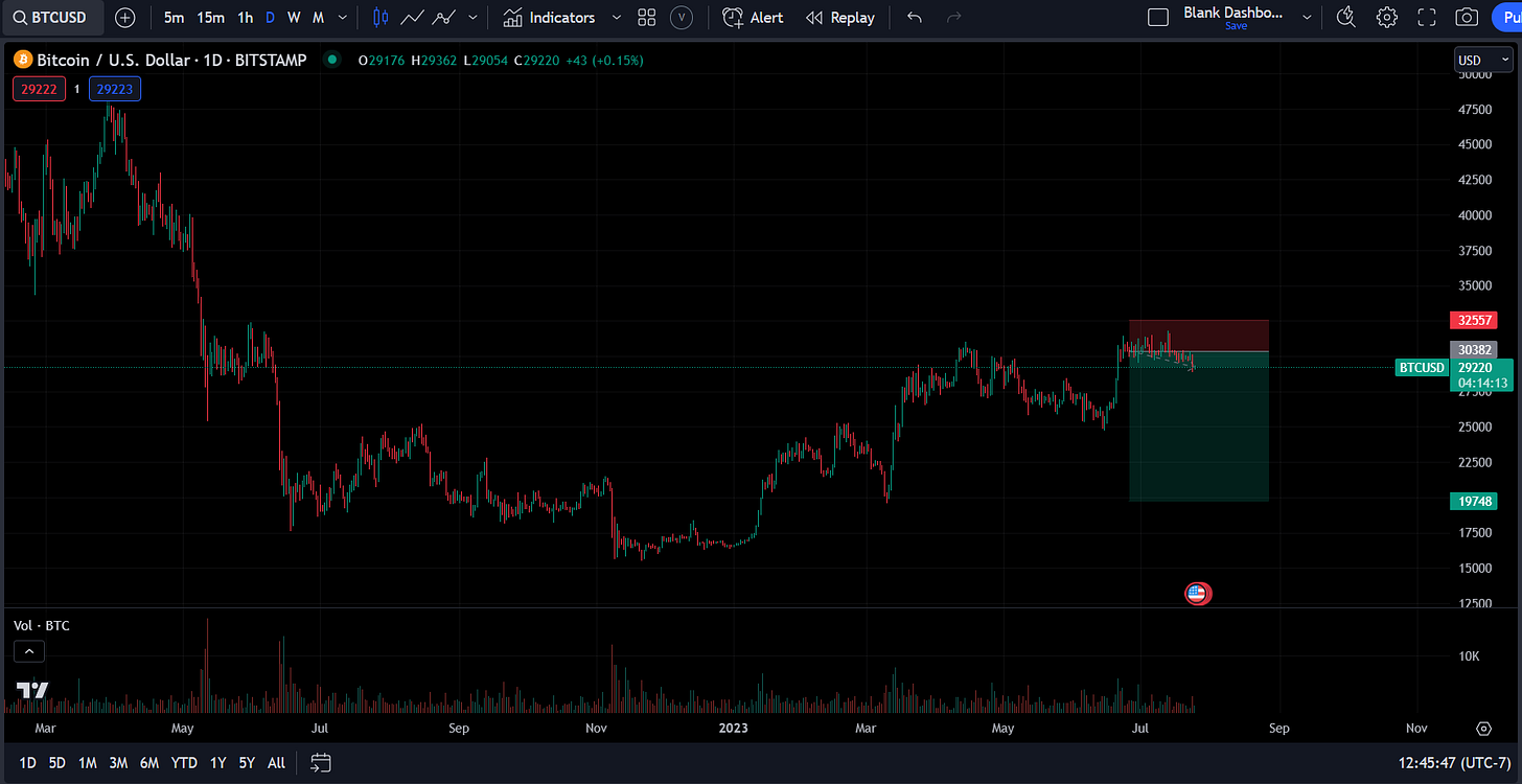
Here is the R:R I have shared multiple times for BTC:
Here is for SOL:
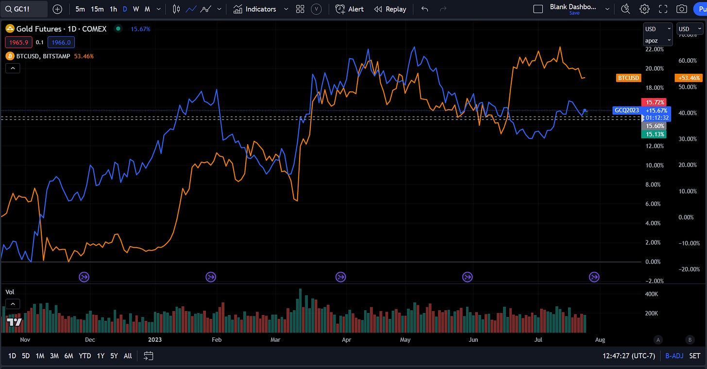
I am watching the BTC and gold correlation in connection with credit risk and the forward curve:
We continue to see BTC track with broad risk on/risk off flows. BTC continues to correlate with higher risk proxies such as ARKK and IPO as opposed to QQQs:
Conclusion:
I will be writing a comprehensive macro report covering each of these ideas in depth for Subscribers.
As I continue to emphasize, we all get the same data, the same information, and the same markets. It is about how you interpret the markets and execute across them that generates value.
In the information age, you simply need to be at the right place, at the right time, with the right information to succeed
Thanks for reading!











The bitcoin and gold correlation connecting to credit risks surprises me. But if I’m thinking about it correctly, BTC is a risk off security while gold is the opposite?
"Valuations are a bit extended for SPX" this bottom up chart is pretty cool. do you know if any other platforms has similar?