

Alpha Report: Macro Tear Sheets, Crude, Curve Regimes
Macro flows and economic data for this week

In this report, we are going to cover 3 key insights from the Macro Tear Sheets, crude’s connection to geopolitical risk, and curve regimes as they are connected to the current macro regime.
The FREE Macro Rate Matrix Dashboard can be found here: Link. The Dashboard will be updated this week with the JOLTS and NFP data. We are at a critical inflection point in the labor market so these data prints carry outsized importance. I will be breaking these data prints down this week as well as adding updated models to the Dashboard so you can seamlessly analyze them on your own.

The Macro Tear Sheets for Fixed Income, Equities, and Bitcoin are here:
Key Insights From Macro Tear Sheets:
All of the macro context has been laid out in the following reports on the Substack over the last 15 days:
Insight #1:
Inflation swaps are at the top end of their range right now pricing a marginal degree of inflation risk due to the recent inflation prints coming in flat to marginally positive. If CPI prints over the next 3 months come in BELOW expectations, these swaps will likely reprice lower.

Insight #2:
We are back at an implied vol premium in equities with an elevated level of skew.

The positioning tensions are not as offside as at the end of 2021 but valuations are at the same levels. (Net COT Positioning in the chart below):
Insight #3:
ETF flows for Bitcoin have slowed as implied volatility has fallen on MSTR 0.00%↑. The implication is that the majority of bullish positioning has reversed. Now the question is, WHERE will the macro regime take us?


Crude:
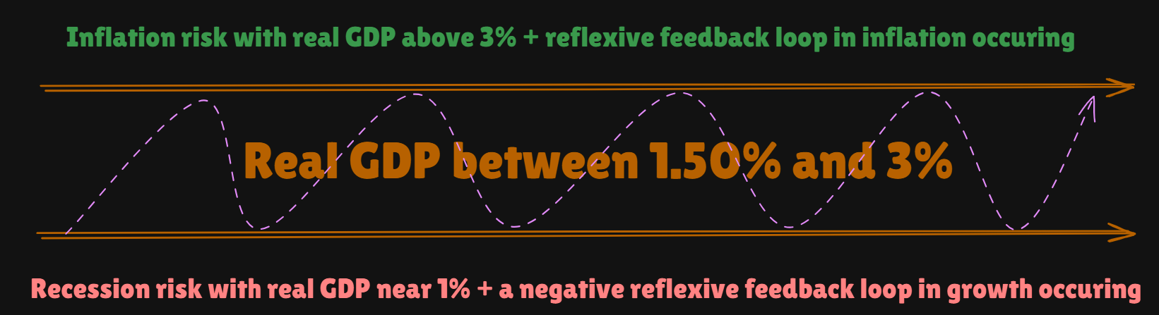
I already laid out the tensions for GDP in this visual (link):
The question is, how does crude connect to this? Crude is driven by supply and demand factors. On the supply side, analyzing any geopolitical risk is critical. This is why watching crude volatility in connection with news and the standard deviation of price movements is important.

On the demand side, crude rallied considerably in 2023 because growth accelerated so much. The chart below shows the Atlanta Fed nowcast (white), the economic surprise index (blue), and crude (orange).
(If you want to do a free trial to review the macro report and all of the research, you can do it with this link: Link)
Keep reading with a 7-day free trial
Subscribe to Capital Flows to keep reading this post and get 7 days of free access to the full post archives.