

Alpha Report: Transmission Of Interest Rates Into Growth
How the changing macro regime is beginning to play out

Main Idea:
In this article, I am going to explain WHY the macro regime is beginning to develop in lockstep with the views laid out in the macro report (link) and how to monitor it with the Macro Tear Sheets and Macro Rate Matrix Dashboard (link).
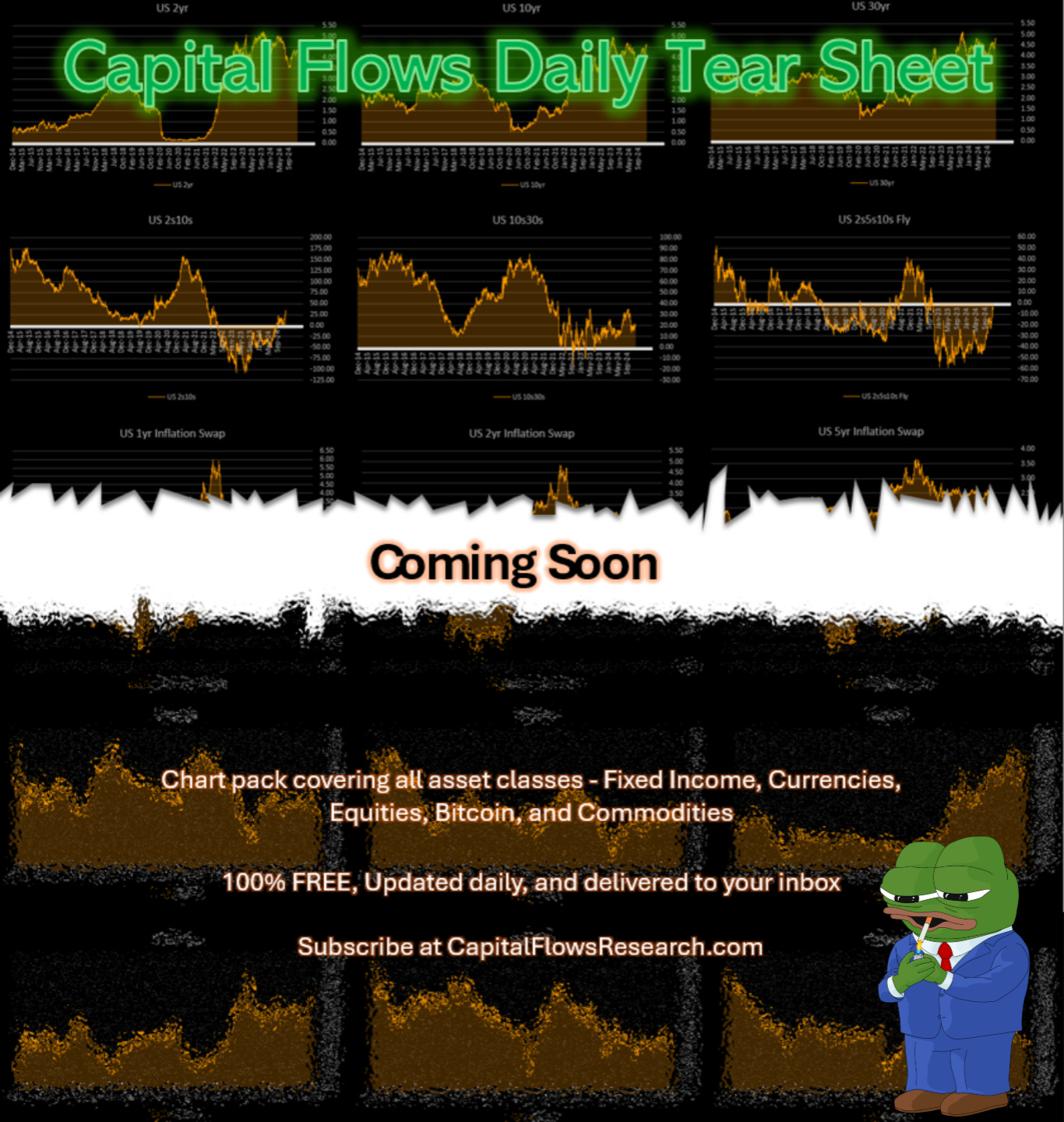
Tear Sheet Announcement:
Having complete visibility across all macro asset classes is one of THE most important prerequisites for taking action. Starting this weekend, Macro Tear Sheets will be sent out to everyone for FREE. These will break down each asset class and the primary relationships to monitor in each asset class. When you begin using these Macro Tear Sheets in connection with the Macro Rate Matrix Dashboard (link), you will begin to have a clear picture of macro flows and HOW they are impacting EVERYTHING.
Why are all of these tools along with all the educational articles (link) free? Because I know what it’s like to start with zero experience, zero knowledge, zero capital, and have to figure everyone out on my own. It’s difficult.
My goal is to lay out this entire process for you so that you can learn everything way faster. This means it is 100% on you. There are no excuses in today’s world.
“You wasted $150,000 on an education you coulda got for $1.50 in late fees at the public library.”
Theme for the year: Take 2025 by storm!

Macro Thesis:
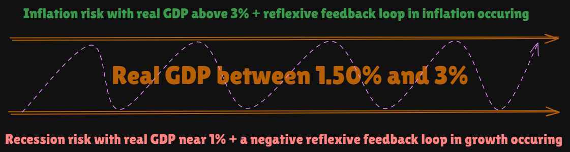
Over the next 90 days, there is one primary macro tension that will determine the distribution of returns for ALL asset classes. This macro tension is WHERE we are in growth and WHERE we are in interest rates. All of the evidence, scenario analysis, and trade implications for this have been laid out in the reports over the last 15 days:
This tension for growth is visualized here and we continue to oscillate in the middle of these two extremes. The KEY to understanding asset class returns (equities, Bitcoin, commodities, etc) is mapping WHERE in the oscillation between these two extremes we are and connecting it to where we are in interest rates (all of the datapoints for this are in the Macro Rate Matrix Dashboard: Link).
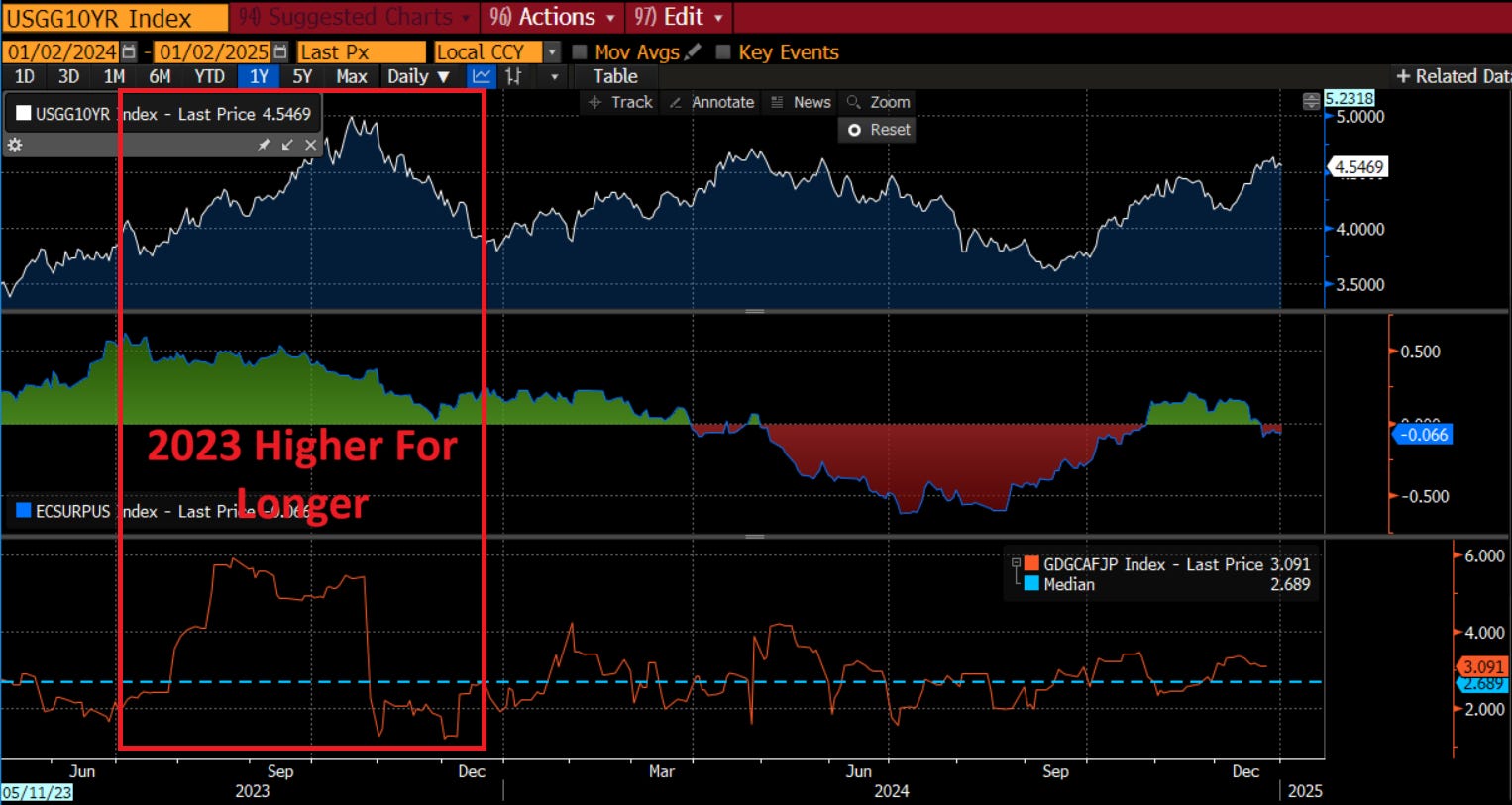
Let me explain in a simpler fashion and connect it to the tangible metrics we use for growth. The chart below is of the 10 year nominal rate (top panel in white), economic surprise index (middle panel in green and red) and the Atlanta Fed GDPnowcast (orange). You will notice in 2023, the LEVEL of growth was much higher. This was one of the reasons it was so difficult for the higher rates to cause a recession. We are now back to the same LEVEL in rates as 2023 except the LEVEL of growth is much lower. The implication is that the risk is much higher for interest rates to transmit into growth and push it lower.
The Signal Of A Regime Shift:
I already laid out how to think about path dependency in markets (link). If you understand this type of framework for making implications in markets, then you will understand how the macro thesis above has a marginal probability of shifting the macro regime into an inflection point.
Keep reading with a 7-day free trial
Subscribe to Capital Flows to keep reading this post and get 7 days of free access to the full post archives.